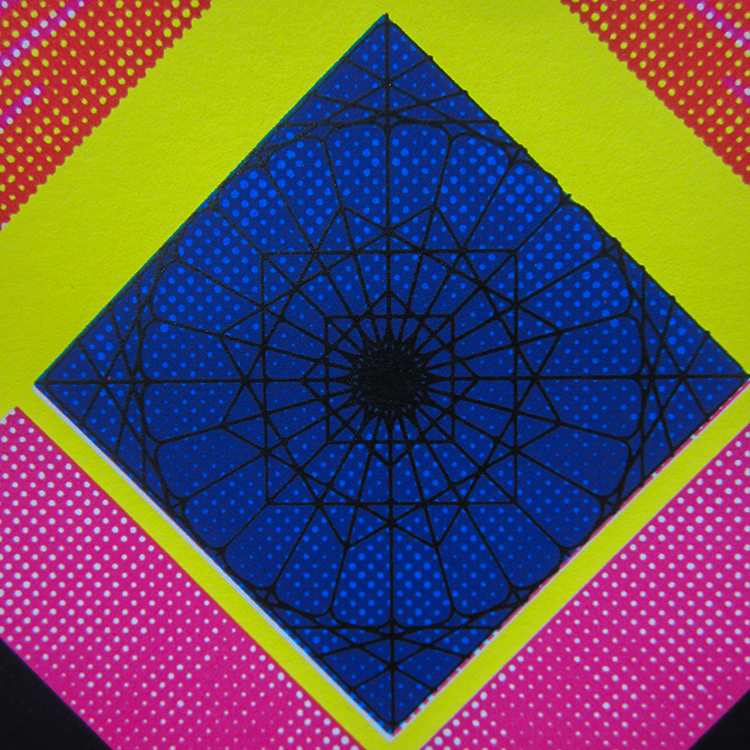
When I was first learning how to screen print, I really put CMYK silk screen prints on a pedestal. I could barely figure out how to pull off basic registration of multi-color prints let alone four-color process prints. I knew I liked halftones and had used them a ton on the wood panel portraits I created for the Friends With Benefits show. Always up for a challenge, I carved out time in my schedule for testing with some of my favorite photographs.
My first experiments back in 2012 were actually pretty decent. At the time, I was printing with all Speedball Acrylic inks. For whatever reason DSLR cameras were everywhere in the late 00’s. I got my hands on one and shot this set of long exposure photos on a hot summer night in my hometown. When I decided to create a CMYK silk screen print of a photo, this image was the first thing that came to mind.
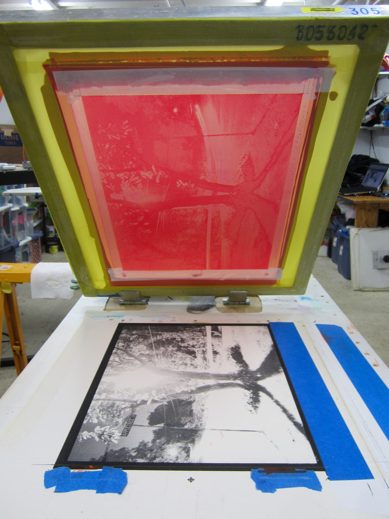
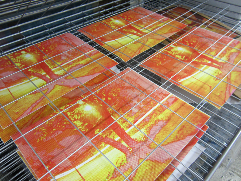

Boston CMYK silk screen prints
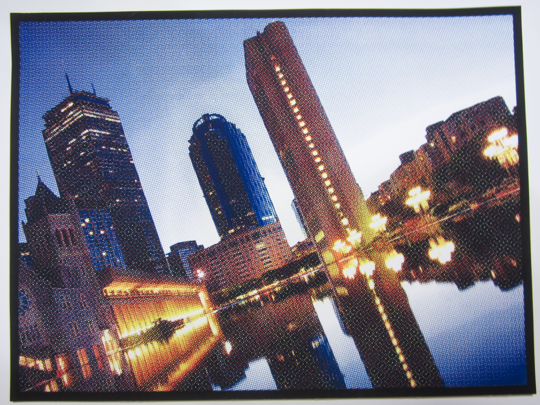
Alongside the long-exposure print, I also created a CMYK silk screen print of one of my favorite photos of Boston. I shot this near the reflecting pool at the Christian Science Center early one summer morning just before the first signs of light hit the city.

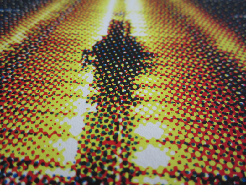
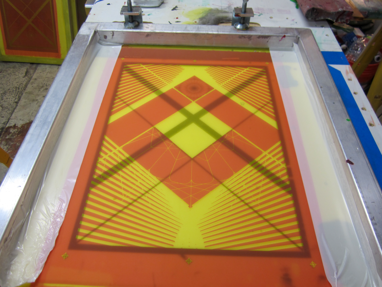
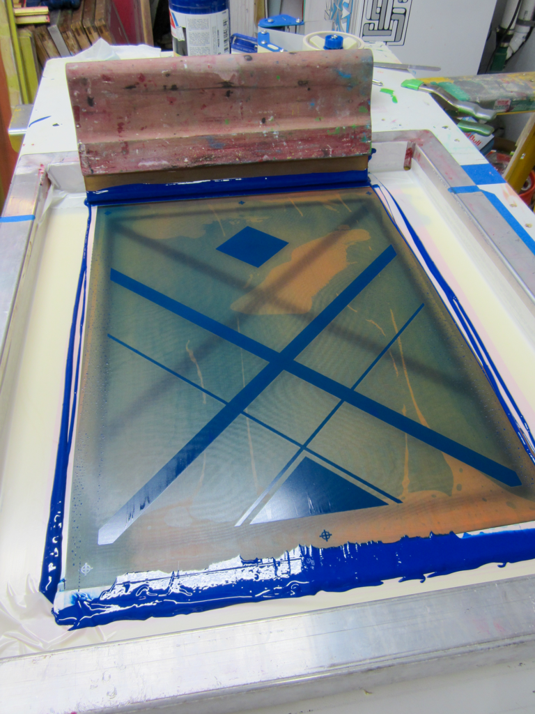
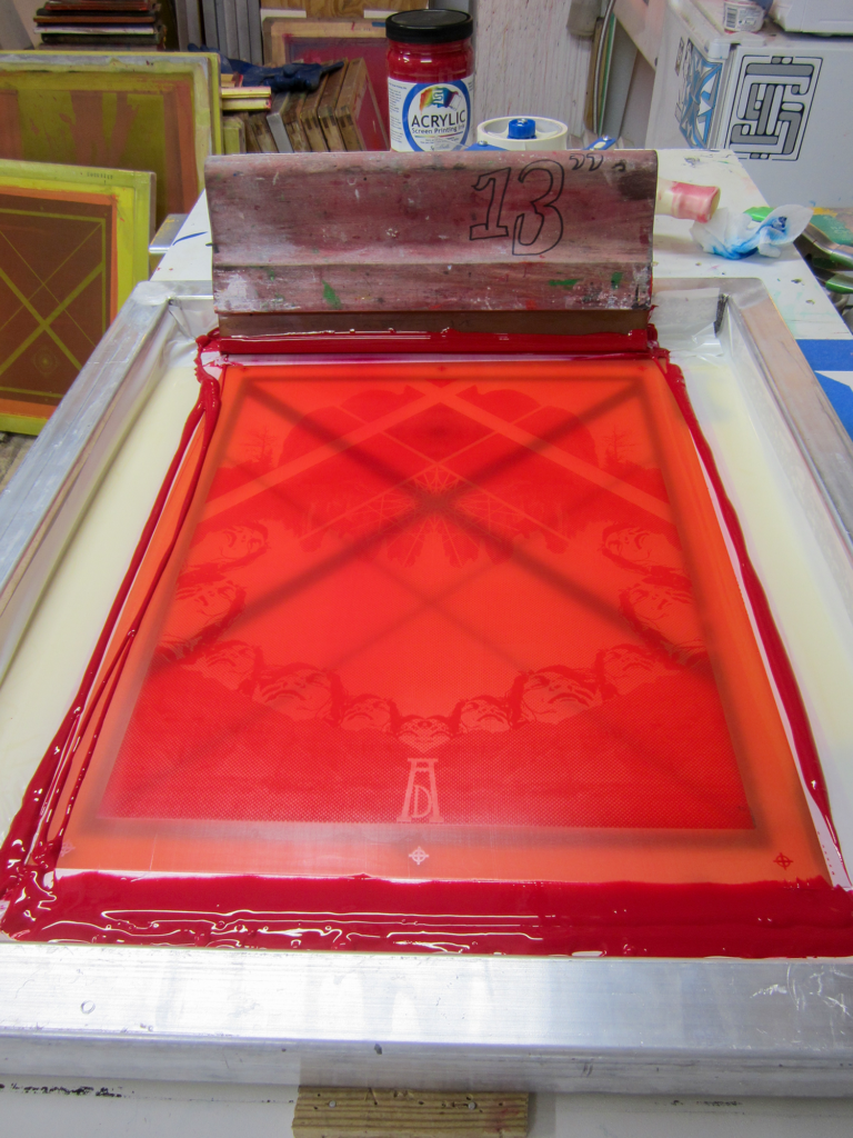
A cross-country road trip and many client-projects later, I was still obsessed with CMYK silk screen prints. I had been thinking about other ways to use the four colors together and I decided to do a series of prints that just used CMYK as the color-palette. I collaged together some geometric design elements to create the “Love” print below. I’m still impressed with the registration on these all these years later:
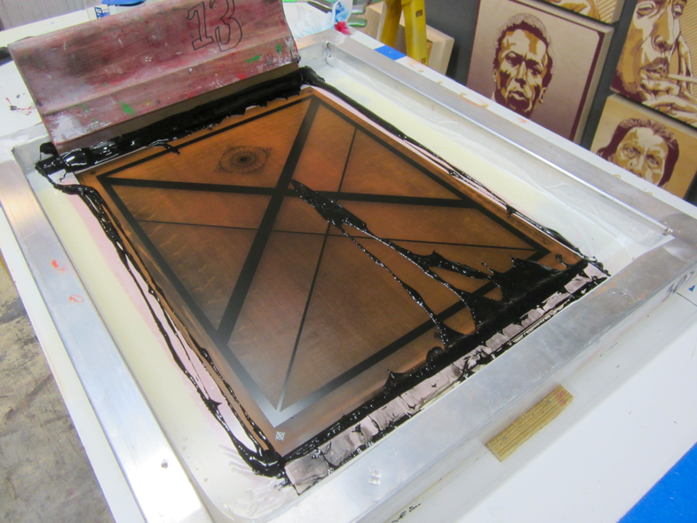
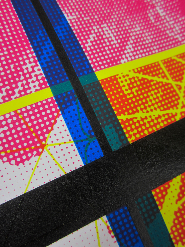
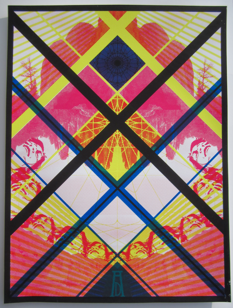
CMYK prints with Spectra inks
I set out to find a brighter cyan after that set of prints and sourced Spectrachem inks after a long talk with my friends at Commercial Screen Supply in Avon, MA. Excited to test what the new ink could do, I created another design almost as a remix to the “Love” poster. The “Adventure” poster incorporated similar geometric elements. I was really happy with the cyan here and didn’t expect the matte finish of the Spectrachem ink.
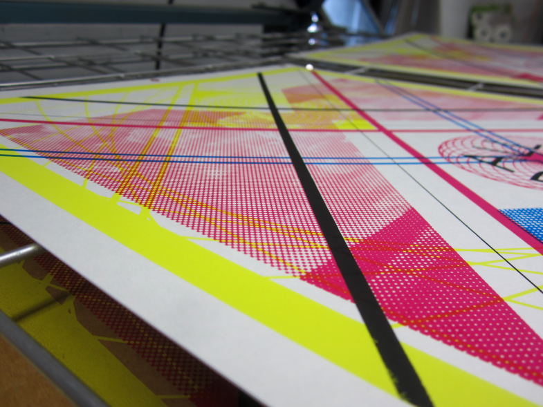

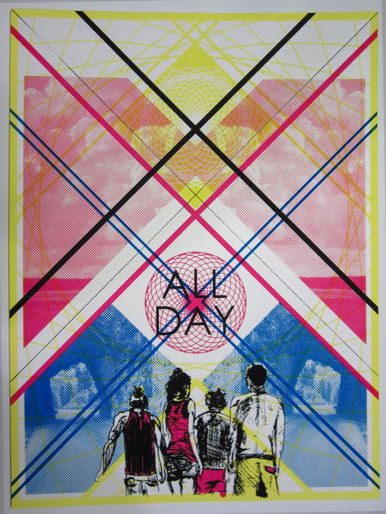
Black light CMYK silk screen prints
I keep coming back to CMYK silk screen prints after all these years. In 2016, I collaborated with some print-maker friends in Boston to create Go To The Light (GTTL), a black-light screen printed poster show. AntiDesigns (my shop), Trifecta Editions and James Weinberg of Weinberg Design each curated and printed a set of silkscreen posters to be displayed under all black light.
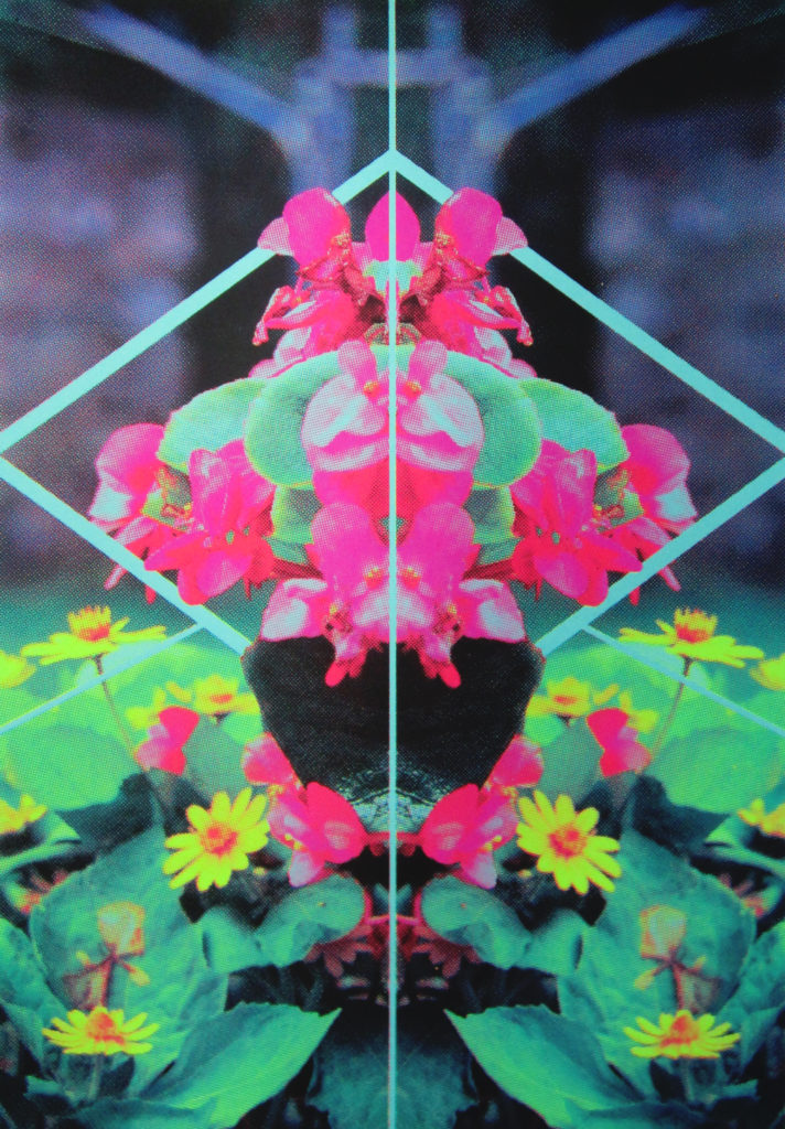
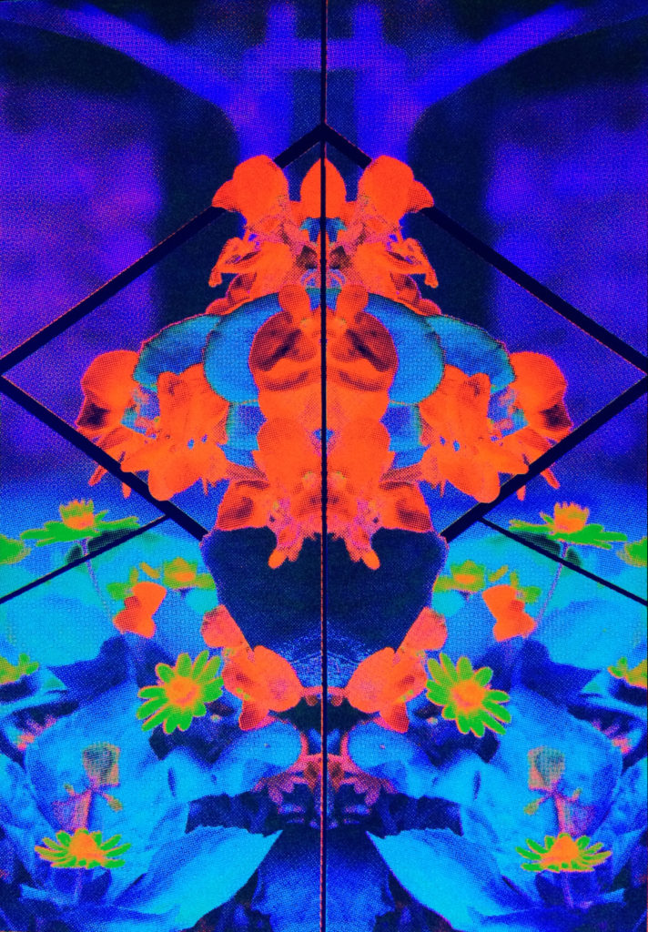
I was able to work with a diverse set of artists for my inclusion into the show. I wanted to create a print of my own as well and set out to do something different. Sometime earlier that year, I created some experimental CMYK prints where I substituted metallic inks for one of the CMYK channels. My favorite print was where we substituted metallic silver for cyan and create a silver-MYK print. For the GTTL show, I thought it could be really cool to create a CMYK blacklight poster where the C, M and Y channels were all fluorescent inks. I executed my idea and the results were super sharp. Shown here are the prints under regular light, black light, and a gif of both.

It’s been a lot of fun creating these posters. I’ve taken everything I’ve learned with these experiments and applied it to client print-work over at AntiDesigns. Hit us up if you’re ever in need of some CMYK silk screen prints for a project you’re cooking up.
